Introduction
A card is a tool used to summarize an object’s key properties on a small two-dimensional canvas. Even before the invention of mobile apps and websites, cards proved useful in a number of contexts. A few examples of cards before mobile apps existed are baseball cards, Pokemon cards, and flash cards to help children learn vocabulary.
What’s great about cards is that each can stand alone or form part of a collection. You can reorder them, filter them, and compare one to another, side by side. Furthermore, cards help us to quickly internalize and mentally categorize large quantities of information.

With mobile apps, we use cards to achieve this same goal. However, instead of a paper canvas, we have a digital canvas. A digital canvas allows us to create rich user experiences that incorporate multimedia and enable the consumption of limitless quantities of information.
In the screenshots below, you can see examples of apps that make use of cards in their user experience.

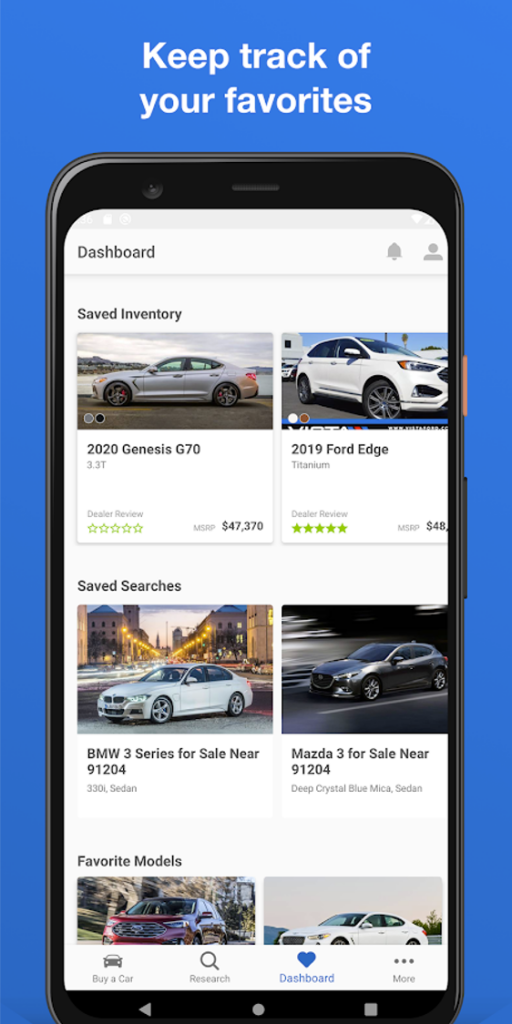
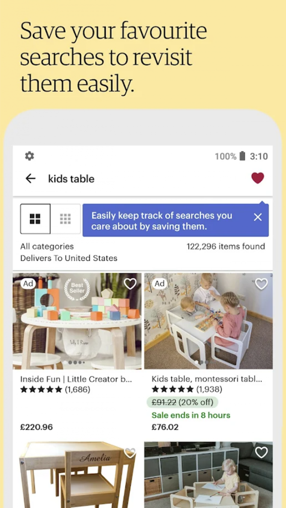
The Flutter framework provides out-of-the-box widgets to enable us to create cards. In this tutorial, you’ll learn how to create and incorporate cards into your Flutter apps.
We’ll cover
- the visual layout of a Flutter Card,
- properties of a Flutter Card, and
- how to create a Flutter Card.
Then, we’ll apply this knowledge by building a demo app that uses cards.
Visual Layout of a Flutter Card
A Flutter Card is typically presented using the layout illustrated below.
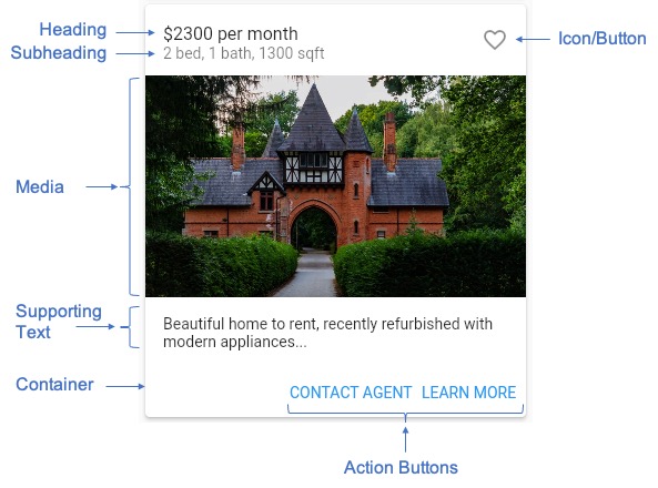
It comprises a header region that contains heading and subheading text, along with an optional icon or button. Then, there’s the middle section where we typically place some form of media, such as a photograph. Below the media component, we can add some supporting descriptive text. At the bottom, either right-aligned or left-aligned, we place action buttons. A user can click on these to navigate to a detail screen where they can explore more information about the item on the card.
All of these components are nested into a container that usually has an outline and shadow underneath, to enhance the visual appearance of a card.
Flutter Card Properties
The Flutter Card widget provides properties to help you customize the cards to fit your particular needs. Below is a subset of the more important properties that you should be aware of.
- The child property is the most important property. This is a widget that goes into the canvas area. You can construct a simple or a complex child widget as needed to achieve your goal. In the next section we’ll explore how to construct a child widget for a Card.
- The color property defines the color of the canvas area of the Card.
- The elevation property is a number that defines how high above the parent widget the Card floats. When the elevation is greater than 0, a shadow appears underneath the card. By default, the elevation is set to 1.0. Therefore, Card widgets have a shadow by default. The larger the elevation number, the higher the card floats above the parent widget, and therefore, the larger the shadow.
- The shadowColor property defines the color of the shadow underneath the Card. By default, the shadow is black.
- The shape property defines the shape of the card’s container. The type of this property is ShapeBorder. By default, a Card’s shape property is set to a RoundedRectangleBorder with a circular corner radius of 4.0.
For a complete list of Card properties, you can review the details on flutter.dev. In the next section, we’ll learn how to define a basic Flutter Card.
How to Build a Flutter Card
Now that we understand the basic concepts, let’s explore the code needed to construct a Card widget in Flutter. The code below is what we would use to create a Card similar to the one shown in the Visual Layout of a Flutter Card section above.
In the code above, we construct a Card widget with an elevation of 4.0 to ensure that we have a visible drop shadow. Notice how the child widget is a Column that creates a vertical layout. The Column is composed of a ListTile for the header area, a Container for the image, another Container for the supporting text, and finally, a ButtonBar for the action buttons.
In the next section, we shall make use of this code when building our demo app.
Demo App
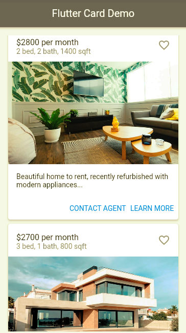
For our demo, we’ll build a simple user interface for a real estate app. When the app launches, we present the user with a scrolling list of cards. Each card will summarize the details of a rental property and include an image of the property. For demo purposes, we’ll use Unsplash Source to obtain random images of houses to insert into the cards.
This demo app does not depend on any third party libraries. Therefore, you can use DartPad to follow along. DartPad is a web-based editor where you can try out Flutter code without the need to install anything on your computer. To follow along with this tutorial, head over to https://dartpad.dev/.
Below is what the final app will look like.
Step 1: Build the App Shell
First, let’s create a basic app shell as a foundation. Paste the code below into your code editor and run the app. You should see an AppBar with the title “Flutter Card Demo.” In the body section, you should see the text “Flutter Card Demo” in the center of the screen.
Step 2: Add the buildCard Function
Next, let’s add a function for building our Card widgets. Paste the code below into the _MyHomePageState class. We’ll invoke this function to generate as many Card widgets as we need.
Step 3: Add the ScrollView to the App Body
The Scaffold widget serves as a skeleton for the app, providing a basic layout including an AppBar at the top and a body area for placing the main content. In this step, we update the Scaffold’s body to include a SingleChildScrollView as shown in the code snippet below. For more information about the SingleChildScrollView widget, see my earlier tutorial Build A Flutter Horizontal ListView in 20 minutes.
When you run the app now, you’ll notice that all the cards have exactly the same content. In the next step we’ll update the buildCard function so that it generates random content each time we call the function.
Step 4: Randomize the Card Content
Finally, let’s replace the variables at the top of the buildCard function with random data. In the real world, you’d have data from a database populate the content for each card, but that’s beyond the scope of this tutorial. For the purpose of our demo, we’ll use random data.
Notice that we first create a Random() object. This comes from the library dart:math that we imported in Step 1; it helps us create random integers for the monthly rental amount, as well as the number of bedrooms and bathrooms.
You’ll see also that we append a random number at the end of the image URL. This ensures that each time we call the buildCard function, our app fetches a new random image from Unsplash Source. If we don’t add this random number, Flutter would use the cached random image from the first time the function got called, and the images on all cards would be same.
Step 5: Test the Complete App
You should now have a fully working app. Try adding more cards and customizing the look and feel. To ensure that the app behaves as expected, make sure to thoroughly test it in different scenarios. If you get stuck, you can refer to the full code listing here: https://dartpad.dev/?id=39c7dd6581463dd1be8a366f2f64b9b0&null_safety=true
Conclusion
In this tutorial, we learned how to use the Flutter Card widget to enrich a mobile app’s user experience. We explored the standard layout that most cards follow, we learned how to construct a Flutter Card widget, and we built a simple real estate demo app to apply what we learned. With this knowledge, you can build your own Flutter apps using the Card widget.
If you want to learn more, a lot of useful content can be found on Waldo. There, you’ll find content on mobile design, mobile engineering, QA & testing, and more.
This post was written by Daliso Zuze. Daliso is an expert in agile software delivery using Scrum. Besides that, he’s an experienced digital transformation consultant and entrepreneur. His technical skills center around mobile app development and machine learning.
Automated E2E tests for your mobile app
Get true E2E testing in minutes, not months.


