Introduction
As the content in a mobile app grows, it is useful to start organizing it into pages. To help users quickly get to the page they want, apps incorporate some form of navigation. Some app designs use tabs to enable jumping from one page to another. These tabs can be at the top of the screen or at the bottom. However, when the number of pages grows beyond five, tabs are not recommended. In such cases, it is preferable to use a side navigation design. On large screens, there’s enough space to display side navigations constantly. However, on mobile screens space is limited, so that wouldn’t work well.
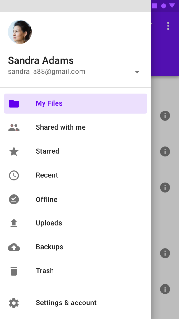
A solution is to have the navigation display over the screen when needed, and disappear when not needed. See below for an example of this design pattern, which material.io describes in great detail.

Flutter provides a widget named Drawer to support this type of navigation experience. In this tutorial, we shall
- describe the typical layout of a Flutter Drawer,
- learn how to build a Flutter Drawer widget for use in an app, and
- build a demo app to apply what we learned.
Visual Layout of a Drawer
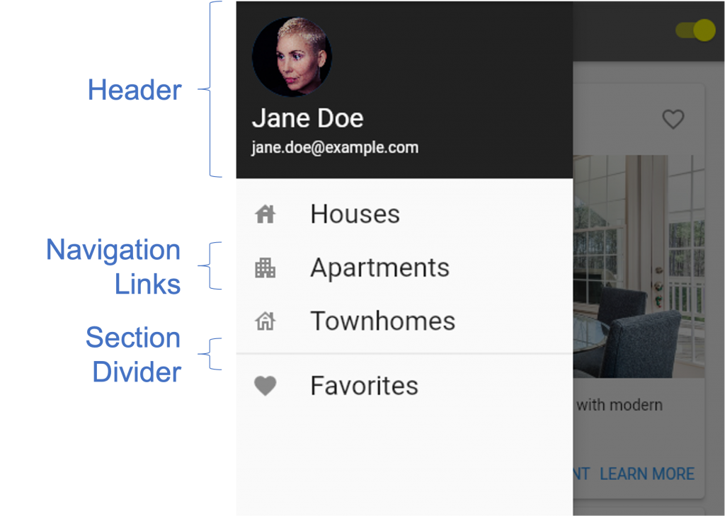
Drawers will typically include a header, a collection of navigation links, and section dividers to separate groups of links. See the image below for an illustration of this layout.

The header area normally includes some profile information about the current user. If the app has a logo, you can include it in the header also. Below the header is where the navigation links go. These links include text and optionally, an icon representation. If there are many links and they can be organized into groups, dividers show the boundaries between the groups.
In the next section, we dive into how to construct a navigation drawer in Flutter.

Building a Flutter Drawer
The Scaffold widget provides an easy way to add a Drawer to your app. In the same way that we define an AppBar and Body, we define a Drawer by assigning it to the drawer property of the Scaffold widget.
When a drawer is configured on a Scaffold, Flutter automatically places a hamburger menu button on the AppBar that can be used to reveal the drawer. Pressing this button causes the drawer to fly in from the left edge of the screen. As an alternative to pressing the hamburger menu button, you can have the drawer revealed by swiping in from the left edge of the screen. To dismiss the drawer, you can tap on the part of the screen not covered by the drawer (for the hamburger menu design) or swipe left (for the swipe right design).
This code snippet shows an example of how to incorporate a drawer in your app.
The Drawer widget has a child property where you can place all the content for the drawer. In this example, we used a ListView widget as the child widget. The ListView enables us to easily add widgets in a column layout. Furthermore, the ListView will scroll if the list is too long to fit on the screen. The header comes first in the ListView, followed by all the navigation links. For the header, we use the UserAccountsDrawerHeader widget that provides a simple layout for user profile information. We use the ListTile widget, which provides a layout that includes an icon and some text, for the navigation links. And for each ListTile, we can set the onTap property to respond to the user’s selection of a navigation link.
Demo App
For our demo app, we’ll improve the real estate app that we created in the previous post, The Flutter Visibility Widget: Show and Hide Content. We’ll use what we’ve learned about the Flutter Drawer widget to enhance the app by including a navigation. The navigation will allow users to switch between pages for houses, apartments, townhomes, and the user’s favorites list.
This demo app doesn’t depend on any third party libraries. Therefore, you can use DartPad to follow along. DartPad is a web-based editor where you can try out Flutter code without the need to install anything on your computer. To follow along with this tutorial, head over to https://dartpad.dev/
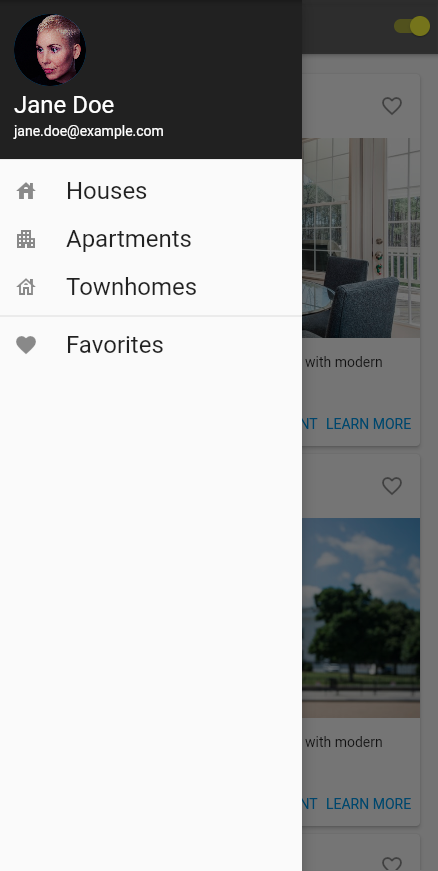
Below is what the final app will look like.

Step 1: Build the App Shell
Firstly, let’s create a basic app shell as a foundation. Paste the code below into your code editor and run the app. You should see an AppBar with the title “Flutter Drawer Demo.” In the body section, you should see the text “Flutter Drawer Demo” in the center of the screen.
Step 2: Declare and Initialize State Variables
Next, let’s declare and initialize the state variables that we need for the app. There are two variables, imagesVisible and cardContent, that hold the state for the app. The cardContent variable holds the content for all the real estate properties that we display and the imagesVisible variable controls the visibility of that content.
Step 3: Add Content Builder Functions
In Step 3, we create functions within the _MyHomePageState class that builds the AppBar and the main body of the app. The _buildAppBar function constructs and returns the AppBar for our app. The _buildBody function constructs the body with all the real estate property cards. The _buildCard function is used by the _buildBody function to construct a single property card. It’s invoked for each property that we generated content for in Step 2 above. Insert the following functions into the _MyHomePageState class of your app.
Step 4: Modify the Build Function in _MyHomePageState to Use the Content Builder Functions Defined
Now that we have functions to construct the content for the app, let’s update our Scaffold to use them to pull in the required content. Update the build function in _MyHomePageState so that it matches this code snippet.
Step 5: Define Function to Build the Drawer
If you have successfully implemented Steps 1 to 4, you should have an app that displays real estate properties, with a switch to show/hide the property images. Next, we add the code needed to construct our Drawer navigation. The _buildDrawer function below constructs the drawer widget we need. Paste the code below into your _MyHomePageState class.
Notice that we included code in the onTap property of each ListTile. This code navigates to a new version of our app’s main page, with a different title. Since this is only a demo, this is sufficient to simulate navigating to a whole new page. For a real world app, you would create unique classes for each of your pages.
Step 6: Add the Drawer to the Scaffold
Finally, use the _buildDrawer function defined in Step 5 to set the drawer property for the app’s Scaffold. Run the app to see the hamburger menu button, and click on the hamburger menu button to see the drawer appear.

Step 7: Test the Complete App
Congratulations, you should now have a fully working app with a Flutter Drawer for navigation. Make sure the drawer is working as expected. Try adding more navigation items and check if the app continues to function normally. If you get stuck, you can refer to the full code listing here: https://dartpad.dev/?id=1ee135d181a021867567b388771fc6c9&null_safety=true
Conclusion
In this tutorial, we learned how to use the Flutter Drawer widget to help users easily navigate to content that they need, and how to incorporate it into an existing app. This is useful when your app’s content begins to grow and no longer fits on a single page. With this knowledge, you can build your own Flutter apps using the Drawer widget.
If you want to learn more, you can find a lot of useful content about mobile design, mobile engineering, QA & testing, and more on Waldo.
This post was written by Daliso Zuze.Daliso is an expert in agile software delivery using Scrum. Besides that, he’s an experienced digital transformation consultant and entrepreneur. His technical skills center around mobile app development and machine learning.
Automated E2E tests for your mobile app
Get true E2E testing in minutes, not months.


