Waldo sessions now support scripting! – Learn more
App Development

An In-Depth Guide to Animating Flutter's Hero Widget

Llamdo
Llamdo
An In-Depth Guide to Animating Flutter's Hero Widget
September 7, 2021
12
min read

When designing a mobile app, it’s important to create a seamless and fluid experience for users as they navigate from one page to another. This is especially important when users drill down to deeper levels in your page hierarchy.

For example, it’s common for apps to have one page that lists a collection of items and a second page that presents the full details of a single item. When the user taps a single item on the list page, the app navigates to the detail page for that item.

In these scenarios, we want the user to recognize that they are “zooming in” to see more detailed information. This creates a fluid experience while helping users maintain context of where they are in the app’s page hierarchy.

A common solution is to display an image for each item on the list page and display that same image on the detail page, usually larger in scale and anchored to a different point. When the user taps the item on the list page, the image from the list animates and morphs into the larger image on the detail page. See below for an example of this type of animation.
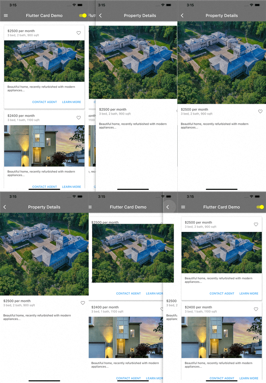
Flutter Hero example

Flutter provides a widget named Hero for creating these animations. In this tutorial, we’ll

  • learn the concepts behind Hero animations,
  • explore the properties of the Hero widget,
  • learn how to build a Hero widget for use in an app, and
  • build a demo app using the techniques we learned.
flutter hero pull quote

Hero Animation Concepts

To master Hero animations, we must understand a few important concepts.

First, Hero animations are only relevant when the app executes a push or pop navigation. If you imagine your app as a deck of playing cards, with each card representing one page in your app, then a push navigation takes one card and places it on top of another. Similarly, a pop navigation is like removing the top card to reveal the one underneath.

Next, we need to understand how the animation works. While the push navigation progresses, Flutter shows the Hero image flying from the first page (or bottom route) to the second page (or top route). At the same time, the Hero image morphs its dimensions to fit the placeholder on the top route. See below for an illustration of how this unfolds.
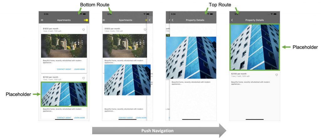
Flutter Hero concepts

Flutter Hero Widget Properties

The Flutter Hero widget contains several properties to customize its behavior. Below is an explanation of the main properties.

The child property is the widget that gets animated during navigation to the next page.

The tag property identifies each Hero widget uniquely on a page. No two hero widgets on the same page can share the same tag. However, when you want to animate a Hero from one page to another, the Hero tag on the first page must be the same as the Hero tag on the second page. This is how Flutter knows what to animate between the two pages.

The placeholderBuilder property defines a widget to place on the destination page while the Hero widget flies into position. By default, this is an empty SizedBox.

The flightShuttleBuilder property defines the widget that flies across the two pages during the animation. By default, this is the child of the Hero widget on the destination page.

The createRectTween property allows you to customize the animation. For example, you can customize the path that the Hero widget takes during its flight from the first to the second page.

The transitionOnUserGestures property is a boolean value that controls whether or not the Hero animation is triggered when a user gesture, such as a swipe, triggers the page navigation.

To learn more about Hero widget properties, visit flutter.dev.

In the next section, we’ll learn how to define a basic Hero widget.

Building a Flutter Hero Widget

Building a basic Hero widget is relatively straightforward. Simply place the item you want to animate as the child of a Hero widget. Remember to assign a unique tag. In the code sample below, item.image will be animated, and item.id is the unique identifier set as the Hero widget tag.


Container(
       height: 400.0,
       child: Hero(
         tag: item.id,
         child:item.image,
       ),
     ),

Demo App

For our demo app, we’ll extend the real estate property app that we created in the previous post, Flutter Drawers Made Easy: A Free Material Design Tutorial. We’ll add the ability to tap on any property card to navigate to a detail page. We’ll also incorporate a Hero animation of the property image between the two pages.

You won’t need any third-party libraries in this demo. In fact, you can use DartPad to follow along. DartPad is a web-based editor that lets you try out Flutter code without installing a special program on your computer. Head over to https://dartpad.dev/ to get started.

Here’s what the final app will look like:
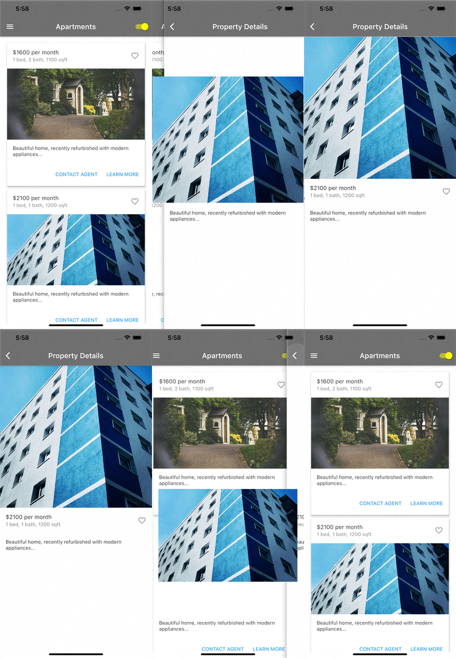
Flutter Hero Final App

Step 1: Build the App Shell

First, we’ll create a basic app shell as a foundation to start us off. Paste the code below into your code editor and run the app. You should see an app bar with the title “Flutter Hero Demo.” In the body section, you should see the text “Flutter Hero Demo” in the center of the screen.


import 'package:flutter/material.dart';
import 'dart:math';

void main() {
 runApp(MyApp());
}

class MyApp extends StatelessWidget {
 @override
 Widget build(BuildContext context) {
   return MaterialApp(
     theme: ThemeData.light(),
     debugShowCheckedModeBanner: false,
     home: const MyHomePage(title: 'Flutter Hero Demo'),
   );
 }
}

class MyHomePage extends StatefulWidget {
 final String title;

 const MyHomePage({this.title = 'Demo'});

 @override
 _MyHomePageState createState() => _MyHomePageState();
}

class _MyHomePageState extends State {
 @override
 Widget build(BuildContext context) {
   return Scaffold(
       appBar: AppBar(
         backgroundColor: Colors.black45,
         title: Text(widget.title),
       ),
       body: const Center(
         child: Text('Flutter Hero Demo'),
       ));
 }
}

Step 2: Declare and Initialize State Variables

Next, we’ll set up the required state variables for the home page of the app. Paste the code below at the top of the _MyHomePageState class. This code will prepare all the real estate property content needed for the app. Note that since this is only a demo, we are generating random content.


class _MyHomePageState extends State<MyHomePage> {
 var imagesVisible = true;

 var cardContent = [];

 @override
 void initState() {
   var ran = Random();
   var tag = 0;

   for (var i = 0; i < 5; i++) {
     var heading = '\$${(ran.nextInt(20) + 15).toString()}00 per month';
     var subheading =
         '${(ran.nextInt(3) + 1).toString()} bed, ${(ran.nextInt(2) + 1).toString()} bath, ${(ran.nextInt(10) + 7).toString()}00 sqft';
     var cardImage = NetworkImage(
         'https://source.unsplash.com/random/800x600?house&' +
             ran.nextInt(100).toString());
     var supportingText =
         'Beautiful home, recently refurbished with modern appliances...';
     var cardData = {
       'heading': heading,
       'subheading': subheading,
       'cardImage': cardImage,
       'supportingText': supportingText,
       'tag': (tag++).toString(),
     };
     cardContent.add(cardData);
   }

   super.initState();
 }

...

Step 3: Add Content Builders

For step 3, we’ll add functions that generate all the needed components of the app’s basic user interface. The functions below build the app’s drawer, app bar, and body. The body comprises a collection of real estate property cards.


Drawer _buildDrawer(BuildContext context) {
   return Drawer(
     child: ListView(
       padding: EdgeInsets.zero,
       children: [
         const UserAccountsDrawerHeader(
           currentAccountPicture: CircleAvatar(
             backgroundImage: NetworkImage(
                 'https://images.unsplash.com/photo-1485290334039-a3c69043e517?crop=entropy&cs=tinysrgb&fit=max&fm=jpg&ixid=MnwxfDB8MXxyYW5kb218MHx8fHx8fHx8MTYyOTU3NDE0MQ&ixlib=rb-1.2.1&q=80&utm_campaign=api-credit&utm_medium=referral&utm_source=unsplash_source&w=300'),
           ),
           accountEmail: Text('jane.doe@example.com'),
           accountName: Text(
             'Jane Doe',
             style: TextStyle(fontSize: 24.0),
           ),
           decoration: BoxDecoration(
             color: Colors.black87,
           ),
         ),
         ListTile(
           leading: const Icon(Icons.house),
           title: const Text(
             'Houses',
             style: TextStyle(fontSize: 24.0),
           ),
           onTap: () {
             Navigator.pushReplacement(
               context,
               MaterialPageRoute<void>(
                 builder: (BuildContext context) => const MyHomePage(
                   title: 'Houses',
                 ),
               ),
             );
           },
         ),
         ListTile(
           leading: const Icon(Icons.apartment),
           title: const Text(
             'Apartments',
             style: TextStyle(fontSize: 24.0),
           ),
           onTap: () {
             Navigator.pushReplacement(
               context,
               MaterialPageRoute<void>(
                 builder: (BuildContext context) => const MyHomePage(
                   title: 'Apartments',
                 ),
               ),
             );
           },
         ),
         ListTile(
           leading: const Icon(Icons.house_outlined),
           title: const Text(
             'Townhomes',
             style: TextStyle(fontSize: 24.0),
           ),
           onTap: () {
             Navigator.pushReplacement(
               context,
               MaterialPageRoute<void>(
                 builder: (BuildContext context) => const MyHomePage(
                   title: 'Townhomes',
                 ),
               ),
             );
           },
         ),
         const Divider(
           height: 10,
           thickness: 1,
         ),
         ListTile(
           leading: const Icon(Icons.favorite),
           title: const Text(
             'Favorites',
             style: TextStyle(fontSize: 24.0),
           ),
           onTap: () {
             Navigator.pushReplacement(
               context,
               MaterialPageRoute<void>(
                 builder: (BuildContext context) => const MyHomePage(
                   title: 'Favorites',
                 ),
               ),
             );
           },
         ),
       ],
     ),
   );
 }

 AppBar _buildAppBar() {
   return AppBar(
       backgroundColor: Colors.black45,
       title: Text(widget.title),
       actions: [
         Switch(
           value: imagesVisible,
           activeColor: Colors.yellowAccent,
           onChanged: (bool switchState) {
             setState(() {
               imagesVisible = switchState;
             });
           },
         ),
       ]);
 }

 Container _buildBody() {
   return Container(
     padding: const EdgeInsets.all(16.0),
     child: SingleChildScrollView(
         scrollDirection: Axis.vertical,
         child: Column(
           children:
               cardContent.map((cardData) => _buildCard(cardData)).toList(),
         )),
   );
 }

 Card _buildCard(Map<String, dynamic> cardData) {
   var image = Ink.image(
     image: cardData['cardImage']!,
     fit: BoxFit.cover,
   );
   return Card(
       elevation: 4.0,
         child: Column(
           children: [
             ListTile(
               title: Text(cardData['heading']!),
               subtitle: Text(cardData['subheading']!),
               trailing: const Icon(Icons.favorite_outline),
             ),
             Visibility(
               visible: imagesVisible,
               child: Container(
                 height: 200.0,
                 child: image,
               ),
             ),
             Container(
               padding: const EdgeInsets.all(16.0),
               alignment: Alignment.centerLeft,
               child: Text(cardData['supportingText']!),
             ),
             ButtonBar(
               children: [
                 TextButton(
                   child: const Text('CONTACT AGENT'),
                   onPressed: () {/* ... */},
                 ),
                 TextButton(
                   child: const Text('LEARN MORE'),
                   onPressed: () {/* ... */},
                 )
               ],
             )
           ],
         ),
       );
 }

Step 4: Update Home Page Scaffold to Use Content Builders

Now that we have all the Scaffold components ready, let’s assign them to the Scaffold properties. Update the _MyHomePageState build function to match the code below.


@override
 Widget build(BuildContext context) {
   return Scaffold(
       appBar: _buildAppBar(),
       body: _buildBody(),
       drawer: _buildDrawer(context));
 }

Step 5: Add New Page for Property Details

If you completed steps 1 through 4, then you should have a basic working app. We will now add a new page that displays the details of a single real estate property. Paste the code below into your editor. Notice that we’re using a Hero widget here to wrap the photo of the property. In step 6 below, we’ll add the corresponding Hero widget to our home page.


class PropertyDetails extends StatelessWidget {
 final Widget image;
 final String tag;
 final Map<String, dynamic> cardData;

 const PropertyDetails(
     {Key? key,
     required this.image,
     required this.tag,
     required this.cardData})
     : super(key: key);

 @override
 Widget build(BuildContext context) {
   return Scaffold(
     appBar: AppBar(
       backgroundColor: Colors.black45,
       title: const Text('Property Details'),
     ),
     body: _buildBody(),
   );
 }

 _buildBody() {
   return Column(children: [
     Container(
       height: 400.0,
       child: Hero(
         tag: tag,
         child: Material(child: image),
       ),
     ),
     ListTile(
       title: Text(cardData['heading']!),
       subtitle: Text(cardData['subheading']!),
       trailing: const Icon(Icons.favorite_outline),
     ),
     Container(
       padding: const EdgeInsets.all(16.0),
       alignment: Alignment.centerLeft,
       child: Text(cardData['supportingText']!),
     ),
   ]);
 }
}

Step 6: Add Hero and Push Navigation to the _buildCard Function

Finally, we’ll update the _buildCard function to incorporate the needed Hero components. First, we wrap the card contents with a GestureDetector. This lets us respond to the onTap event to trigger a push navigation to the detail page. Second, we wrap our card image with the Hero widget.


Card _buildCard(Map<String, dynamic> cardData) {
   var image = Ink.image(
     image: cardData['cardImage']!,
     fit: BoxFit.cover,
   );
   return Card(
       elevation: 4.0,
       /* 1. WRAP COLUMN WITH GESTURE DETECTOR FOR PUSH NAVIGATION */
       child: GestureDetector(
         onTap: () => {
           Navigator.push(
             context,
             MaterialPageRoute<void>(
               builder: (BuildContext context) => PropertyDetails(
                 image: image,
                 tag: cardData['tag'],
                 cardData: cardData,
               ),
             ),
           )
         },
         child: Column(
           children: [
             ListTile(
               title: Text(cardData['heading']!),
               subtitle: Text(cardData['subheading']!),
               trailing: const Icon(Icons.favorite_outline),
             ),
             Visibility(
               visible: imagesVisible,
               child: Container(
                 height: 200.0,
                 /* 2. WRAP CARD IMAGE IN A HERO WIDGET */
                 child: Hero(
                   tag: cardData['tag'],
                   child: Material(child: image),
                 ),
               ),
             ),
             Container(
               padding: const EdgeInsets.all(16.0),
               alignment: Alignment.centerLeft,
               child: Text(cardData['supportingText']!),
             ),
             ButtonBar(
               children: [
                 TextButton(
                   child: const Text('CONTACT AGENT'),
                   onPressed: () {/* ... */},
                 ),
                 TextButton(
                   child: const Text('LEARN MORE'),
                   onPressed: () {/* ... */},
                 )
               ],
             )
           ],
         ),
       ));
 }

Step 7: Test the Complete App

Congratulations—you’ve made a fully functional app! Make sure the Hero animations work as expected. If you get stuck, take a look at the complete code listing here.

flutter hero pull quote

Conclusion

This tutorial demonstrated how to use the Flutter Hero widget to help users maintain context when navigating an app’s page hierarchy. This improves the overall experience for users of your apps. We built a demo to show how to apply Hero widgets in a real estate app. You’re ready to build your own Flutter apps with the Hero widget.

Want to learn more? Check out Waldo. There, you’ll find content on mobile design, mobile engineering, QA & testing, and more.

This post was written by Daliso Zuze.Daliso is an expert in agile software delivery using Scrum. Besides that, he’s an experienced digital transformation consultant and entrepreneur. His technical skills center around mobile app development and machine learning.

Automated E2E tests for your mobile app

Waldo provides the best-in-class runtime for all your mobile testing needs.
Get true E2E testing in minutes, not months.

Reproduce, capture, and share bugs fast!

Waldo Sessions helps mobile teams reproduce bugs, while compiling detailed bug reports in real time.