With the introduction of the Dark Mode feature in macOS Mojave in September 2018, and later in iOS and all other platforms, Apple started opening the doors to developers to allow users to have a certain degree of control over the appearance of their apps. Since then, the momentum seems to be continuing forward, as SwiftUI has made the process to make apps compliant with Dark Mode features even simpler.
If you have no experience with Dark Mode or the new workflow for implementing this feature with SwiftUI, read on.
This article will briefly introduce SwiftUI Dark Mode with a simple implementation of a form. You’ll find out the best course of action to adapt your app to use Dark Mode, and you’ll take a look at some basic testing. By the end of this post, you’ll be the proud owner of a basic iOS project with the fundamentals implemented.
I’m assuming that you have experience with Swift and Xcode 12. However, If you have no experience in these tools, take some time to read about them here.
Supporting Dark Mode
The prospect of supporting Dark Mode on a complex and top-rated app can be daunting! If it hasn’t been a priority for your team or business until now, the scale of changing every view and ensuring that it looks good on every device can be off-putting.
Thankfully, the framework already does a lot for you. If you haven’t already, try it in the previewer, and see how the app reacts to it. Views like ScrollView, Form, List, Buttons, Text, and the like already respond well unless you’ve specified some customization on them.
But what if you’re just looking to implement your app, and you want to make sure you have Dark Mode support right off the bat? In that case, let’s create a simple form app. Even if that isn’t the situation you’re in, you can see along the way how to make the correct modifications to support Dark Mode in your existing project.
Before that, though, let’s make sure that we’re on the same page with the SwiftUI workflow.

Getting to Know the SwiftUI Workflow
Much has changed in the workflow required to develop SwiftUI projects. However, Xcode likely still feels familiar to you. If you haven’t had the opportunity to work on a SwiftUI project before, I highly recommend that you get acquainted with it.
Nevertheless, I’ll give you a brief summary of what you’ll have in front of you when you create your first project.
Your newly created project currently has two files in it. It’s got a ContentView.swift file and an <APP_NAME>App.swift file, where APP_NAME is the name you used for the project.
The App.swift file is your root class. Don’t worry about it. Let’s focus on the ContentView.swift class instead.
With SwiftUI, all View classes have similar structures: a View struct and a PreviewView struct helping the emulator display the preview in real time.
The ContentView struct has a body variable of type View that tells the system how to draw the view. Any modification that you do here will be reflected in the preview view immediately.
As expected, your view contains a TextView object with the familiar “Hello World!” statement.
Now it’s time to start working on your View.
Dark Mode Sample
Now that you’ve got a better understanding of what you can accomplish with Dark Mode in your app, let’s test it on the previewer with your “Hello World!” code.
To see your app in Dark Mode, just add the following code to the ContentView_Previews() method.
This simple change gives you the following:
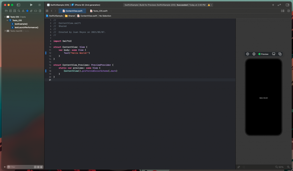
Great! That was easy, right?
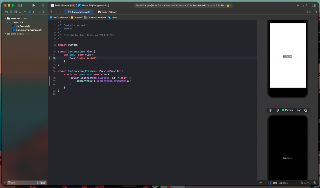
Now, ideally, you’d want to have both light and dark representations of the preview so you can save some time. To do this, let’s modify the code a little bit.
That way, you get two previews stacked on top of each other so you can work more efficiently. Simple, right?
Moving on, let’s add some elements and put them inside a form. If you feel a bit lost when you look at the code below, I recommend you check our previous post on working with SwiftUI Forms.
Once you’ve implemented this, you can see that Swift is smart enough to display the elements in both Light Mode and Dark Mode without any work on your part.
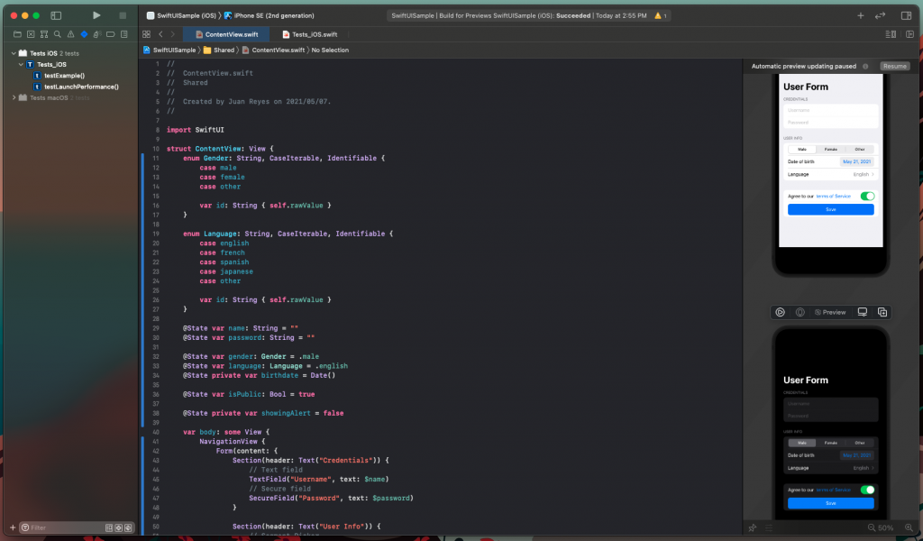
As you can see, this is a straightforward implementation of the most common elements in a simple user form.
Pretty neat!
But what if you want to detect when Dark Mode is enabled and make custom adjustments to some views? Well, let’s see how you can detect the state of the environment.
Customizing Dark Mode
Detecting the state of the environment to make customizations is pretty simple in SwiftUI.
Add a variable preceded by the @Environment clause with the colorScheme modifier.
In my case, I called it currentMode, but you can call it anything you want.
This environment variable will inform your view of the current systemwide state of Dark Mode. Now, you can do customizations depending on the value, like this:
This gives you the expected result:
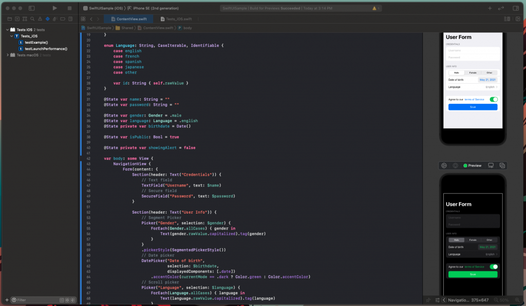
Note: I added modifiers to some elements, depending on what I wanted to change to keep a cohesive style on the form.
You can go further and modify the appearance of the container form itself. And you can even create custom elements that respond to the selected scheme and the environment.
For further reading, check out Apple’s advice on supporting Dark Mode in your interface.
Now, let’s make sure that your work stays in order.
Testing Your Work
With a complete implementation of Dark Mode in your hands, it’s time to create some tests to ensure that your code is clean and works as intended. To do that, let’s work with Xcode’s UI testing framework, which is already bundled in the project.
Now, open the Test iOS folder, and double-click on the Test_iOS.swift class file. Once that’s open, you’ll see everything you need right there to start testing. Go ahead and run it.
Once that’s done, to test that your code is working as intended, add the following to the testExample() function:
Now, run that test. Check that the views respond accordingly and the alert displays. You can also change the state of the emulator to Dark Mode and see how it looks.

Excellent!
If you’re eager to do more testing, you can find additional info on testing in Xcode UI here. Additionally, if testing with Xcode is too complex for you, then you’ll want to find out how to implement complex testing without needing to touch any code. You can find great solutions at Waldo.io. Waldo has plenty of blog entries on mobile QA and testing. There’s even a free trial if you’re a new user.

Should You Implement Dark Mode?
Dark Mode is a convenient feature, and it certainly affects the user experience. However, it’s unlikely to be the factor that takes your application from good to great.
So, should you consider skipping Dark Mode? Well, it isn’t easy to say. Even though the process of implementing support for Dark Mode was pretty approachable and straightforward in this article, you might find some difficulties if you’ve got an extensive and complex project that has many people working on it.
If you’re starting a new project, then absolutely have Dark Mode support at the top of your list—especially if your app leans heavily on content consumption. However, what if you have an established project on your hands with a lot of code and a tight schedule? Then I’d say to sit on it until you decide to schedule a significant design change in your project.
Learn more about Waldo's SwiftUI support here.
Automated E2E tests for your mobile app
Get true E2E testing in minutes, not months.


